Number of Axes in LibreOffice Calc Charts
LibreOffice Calc supports various chart types (e.g., Column, Line, Pie, Scatter), each with a specific number of axes determined by its purpose and data representation. Axes in Calc charts are used to scale and label data, typically including the X-axis (horizontal), Y-axis (vertical), and sometimes a Z-axis (for 3D charts) or secondary axes for complex datasets. Here’s a breakdown:
1. Standard 2D Charts with Two Axes (X and Y)
Most common Calc chart types use two axes:
- X-Axis: Represents categories or independent variables (e.g., months, names).
- Y-Axis: Represents values or dependent variables (e.g., sales, quantities).
- Chart Types:
- Column: Vertical bars (e.g., sales by month).
- Bar: Horizontal bars.
- Line: Data points connected by lines (e.g., trends over time).
- Area: Filled areas under lines.
- Scatter (XY): Plots data points by coordinates (e.g., height vs. weight).
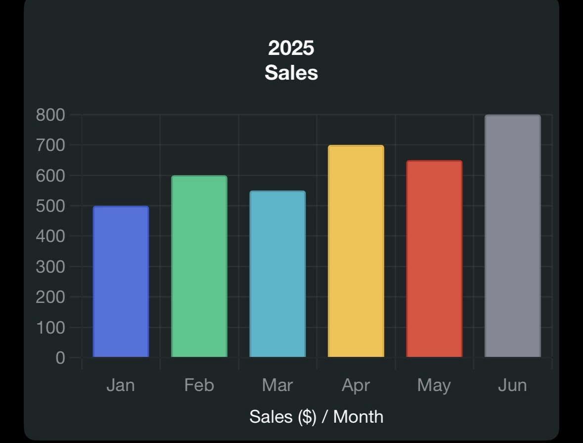
- Example: A Column chart of monthly sales (X-axis: Jan, Feb, …, Jun; Y-axis: Sales in $) has two axes.
- Configuration: Set in the Chart Wizard (Insert > Chart > Chart Elements), where you can label axes (e.g., “Month” for X, “Sales” for Y) and adjust scales (linear, logarithmic).
2. 3D Charts with Three Axes (X, Y, Z)
3D chart variants add a Z-axis for depth, though it’s often cosmetic rather than functional:
- Chart Types: Column, Bar, Line, Area (with “3D Look” enabled in Chart Wizard).
- Axes:
- X-Axis: Categories (e.g., months).
- Y-Axis: Values (e.g., sales).
- Z-Axis: Depth or additional dimension (e.g., product categories in a stacked 3D chart).
- Example: A 3D Column chart showing sales by month and product type has three axes, but the Z-axis is typically used for visual grouping rather than precise data.
- Note: The Z-axis is less common and limited to specific 3D chart types. It’s not available in 2D charts like Pie or Scatter.
3. Charts with Secondary Axes (Up to Four Axes)
Calc allows secondary axes (additional X or Y axes) for datasets with different scales:
- Secondary Y-Axis: Common for plotting two data series with different units (e.g., sales in $ and units sold).
- Secondary X-Axis: Rare, used for dual-category comparisons.
- Chart Types: Column, Line, Scatter, or Combination charts.
- Setup: In Chart Wizard (Data Series tab) or after chart creation (right-click chart > Insert/Delete Axes > Secondary Y-Axis).
- Example: A Line chart with sales (Y1-axis) and profit margin % (Y2-axis) over months (X-axis) has three axes (one X, two Y). Adding a secondary X-axis (e.g., for different time scales) yields four axes.
- Use Case: Compare temperature (Y1) and rainfall (Y2) across months (X1) and years (X2).
4. Charts with No Axes
Some chart types in Calc have no axes:
- Pie: Shows proportions (e.g., budget categories) without axes, using slices instead.
- Doughnut: Similar to Pie, no axes.
- Radar: Uses a circular grid with radial axes (not traditional X/Y), where each axis represents a variable.
- Example: A Pie chart of expense categories (e.g., 40% rent, 30% food) displays data as percentages without X/Y axes.
Summary of Axes by Chart Type
Chart Type Typical Number of Axes Notes Column, Bar, Line, Area, Scatter 2 (X, Y) Secondary axes can add up to 4 3D Column, Bar, Line, Area 3 (X, Y, Z) Z-axis is visual, not always functional Pie, Doughnut 0 No axes, uses slices Radar Variable (radial) Each variable has a radial axis Bubble 3 (X, Y, bubble size) Bubble size acts as a pseudo-Z-axis
How to Configure Axes in Calc
- Insert Chart: Select data (e.g., A1:B7 for months and sales), then Insert > Chart.
- Choose Type: Select a chart type in the Chart Wizard (e.g., Column).
- Set Axes:
- In Chart Wizard’s Chart Elements tab, enable/disable X/Y axes and add labels (e.g., “Month” for X, “Sales” for Y).
- For secondary axes, go to Data Series tab or right-click chart > Insert/Delete Axes post-creation.
- Customize: Double-click axes to format (e.g., change scale, add gridlines, or set logarithmic scale).
- 3D or Special Charts: Enable “3D Look” for Z-axis or choose Pie/Radar for axis-free options.
Example: For a Column chart of sales data:

This chart has two axes (X: Month, Y: Sales).
Additional Notes
- Customization: Axes can be formatted for linear/logarithmic scales, custom intervals, or gridlines (right-click axis > Format Axis).
- Limitations: Pie/Doughnut charts lack axes, limiting their use for trend analysis. Secondary axes are unavailable in some chart types (e.g., Pie).
- Extensions: Add-ons like DataPilotTools (from extensions.libreoffice.org) enhance charting for pivot table data.
- Compatibility: Calc’s charting engine (based on LibreOffice’s internal renderer) supports up to four axes in advanced setups, unlike some tools limited to two.
Clarification on Your Query
Your question asked, “How many aves does chart in calc have,” likely intending “axes” given the context of Calc and charts. I’ve detailed the number of axes by chart type, focusing on standard and advanced configurations. If “aves” refers to something else (e.g., a typo for “averages,” a specific chart feature, or data related to the Vivo V50 Lite from earlier queries), please clarify. For example:
- If you meant “averages,” I can explain functions like
AVERAGEin charts. - If “122” from previous queries relates to a specific chart or dataset, provide details.
- If you want a specific chart type or axis configuration, let me know.
For more on Calc charts, check the LibreOffice Help or community forums. Experiment with Calc’s Chart Wizard to explore axes in action!
Answer Summary: Most Calc charts have 2 axes (X, Y) for 2D types like Column or Line, 3 axes (X, Y, Z) for 3D variants, up to 4 axes with secondary X/Y axes in complex charts, and 0 axes for Pie/Doughnut. Radar charts use radial axes (variable count).